2016 Regionals Logo Rankings

6/24/2016
by Trent Steffes and Evan Bortmas
If you know me, you know I love logos. I also love rankings my peers. So is there any better way to show some pre-tournament article love than ranking my peers' logo? Yes. And that is ranking my peers' logo with the help of two-time NWLA Tournament Champion, Evan Bortmas from the WSEM Dads. Evan is an artist in Chicago right now, and seems to like logos just as much as I do, so I couldn't pass up the opportunity to work with a professional artist and rank logos with him. Big thanks to Evan for his contributions to this piece and availibility.
So the process for this one is simple: we will go from region to region and rank the teams' logos, critique the logos, and then give it a grade.
OCWA Region (Bortmas)
6. GAWL Stars
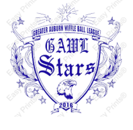
I hate to be ‘that guy’, but this logo is absolutely atrocious. They went to a t-shirt printing website, picked out the busiest design, submitted a few lines of text, and *poof* - instant generic logo. It looks like something I’d see poorly screen printed on a t-shirt from a D-5 high school spirit-shop. The least they could have done was pay for it in order to remove the watermark… On the bright side, at least they have a clever name. 1/10
5. MFWL Road Runners
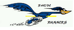
They found one of the first images of Road Runner on Google images and added an oddly-placed, cartoony-font wordmark and wiffleball bat to it. At least they tried. 4.5/10
4. PWL Nationals
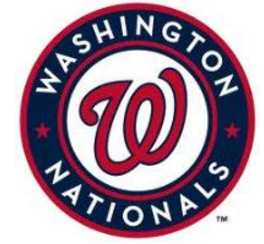
Not much to say here, they just used an MLB logo. I’m actually a big fan of the Washington Nationals logo, but I’m confused as to why the NWLA commissioner’s team has the logo with the least amount of effort put into it... 5/10
3. SEA Freeze
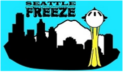
This is a hard logo for me to mark down, as it efficiently represents Seattle with the game, but I wish they would have done something different with the wordmark. It looks like they put a good effort into making an iconic logo, but it definitely could have used a few small tweaks to make it stronger and stand out more. Overall a nice look, though. 6.5/10
2. TBW Lightning
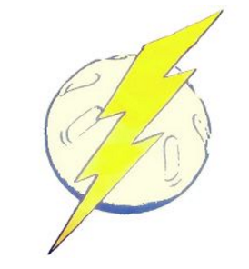
Although it looks suspiciously like clip art, I really like the colors and simplicity of this logo. It might not be one of the best designs, but TBW proves legitimacy to their identity on the field; plus their jerseys are consistently some of the best each year. 7/10
1. OCWA Freaky Franchise
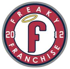
Freaky Franchise has a new identity in 2016, and it didn’t take long for me to get used to it. This is a great use of a traditional-style baseball logo while honoring their own tradition by including their circa year. Obviously drawing inspiration from the Los Angeles Angels secondary logo, the halo is a bit confusing but this is probably my favorite logo in the tournament this year. 9/10
WSEM Region (Steffes)
6. GCWL Make Wiffleball Great Again
No logo. BEAHBEAHBEAHBEAHBEAHBEAHBEAHBEAH!!! 0/10
5. KWL Keggers
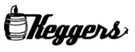
So I am a big opponent of script logos as primary logos. Even with that aside, I'm still not a fan of this logo. The league logo is really cool, IMO. But the Keggers logo seems a little lazy. It works GREAT as a script logo. Just lack luster primary. 4/10
4. LWA Legends of Leroy
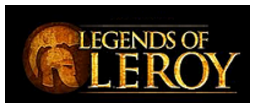
So it may be just me, but it seems like this is another SRL-esque picture logo. I honestly don't get it when a logo has a background color. What's a Legend of Leroy and what does it have to do with a Trojan? Great question. If I were a true professional, I'd have an answer for you. But I'm not, and this is an opinion piece so here's my opinion: logos should have detail, but not too much detail. This one has too much detail. 4.5/10
3. HWL Blizzard
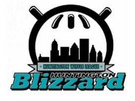
The jury is still out for me on team logos that are just a different version of the league logo. I see the merit, but I feel like the only shared quality between the league scheme and the team logo should be colors. But my main beef with this HWL logo is that there is nothing resembling a Blizzard on it. The skyline could have snow on them, or even just a snowflake somewhere. Also, "Huntington" appearing twice in the logo is a big no-no. 6.5/10
2. GBL Paw Chests
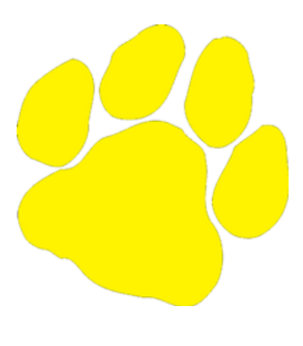
So to a non-logo enthusiast, this one may appear to be boring. But to myself, this logo is actually perfect. I'm a fan of the "less is more" method in logo making, and Jeremy Ratasomething picked a good logo here. A bit blunt for the name Paw Chests, but it works, so well done, boys. 7/10
1. WSEM Dads
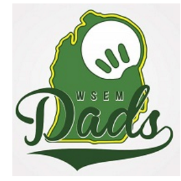
So you may have realized by now: I'm a hypocrite. I sit here and preach these rules, and then commend leagues when they break them (sometimes.) But logo criticizing is very conditional and WSEM is another case of that. I said before it's bad to just replicate the league logo. But WSEM absolutely makes it work here. See, their league logo is simple and elegant. So when it's used as a complementary piece in the team logo, it CAN work. And this logo totally works. It's a simple addition of a clean script, with their iconic logo as the backdrop. Well done, WSEM. Can't wait to get my Dads shirt. 9/10
BWBL Region (Steffes)
6. SRL Hotel Sterling
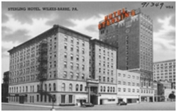
I'll be bold here and call this logo the worst in the field. I mean, it's simply a picture. It's not a rendering of the hotel, it's not a simplistic picture even, it's just straight up a picture. Not a fan, they could do better if you ask me. 1/10
5. HVWBL River Monsters
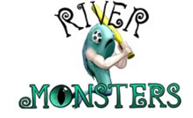
I love the River Monsters, I really do. Kris Morse is in my wiffle circle. But he knows it and if you have read any of my work in the past, I hate this logo. That fish haunts my dreams. However, I must admit that the script has grown on me. The eye in place of the "o" is a really nice, subtle touch. 5/10
4. BWBL Breaker Boys
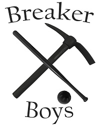
This logo is simply not memorable. Don't get me wrong, it's a decent logo. I like the incorporation of the wiffle bat with the pick axe, but the addition of the ball seems forced. In a different note, what exactly is a breaker boy? Like how a wiffleball breaks? Do they break rocks? I don't care, literally anything is better than SHIT. 6/10
3. WWF New Wiffle Order
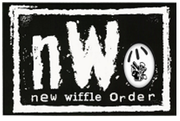
Like their in-state counterpart, BWBLPA, WWF had a good logo with good elements that was taken just a bit too far. The wiffleball in place on the "o" in nWo is very nice. The addition of the Uncle Sam guy in the ball? Too much. And if I'm getting nitpicky, the "wiffle" script obviously looks edited in there. They did a good job getting the right script, but a little more effort could've been given to make it look more natural. And I just noticed the subtle outline of Pennsylvania in the league logo. Extra points!! 7/10
2. IWBL Hot Rods
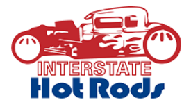
As far as new league logos go, this one is a winner. They went with a classic blue and red color scheme to match their league logo, which is creative considering the namesake. I believe the incorporation of the wiffleballs into the wheels of the hot rod is seamless. And I also like the font. The nailed their team logo. 7.5/10
1. HFWB Hitmen

Not a lot to crticize with an Aussy logo production. This particular one is so fresh and clean. Being a wrestling fan, the color scheme and team name are glorious. In terms of professionalism and production, this may be the best logo in the tournament. 8/10
HRL Region (Bortmas)
6. BWACS Lot Lizards
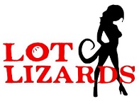
I’m at a loss for words with this logo. If it weren’t for the wiffleball in the ‘o’ of the wordmark, I would have absolutely no idea what it represents. And somebody PLEASE explain the reasoning behind adding sex appeal to the lizard… 1.5/10
5. SFWL Loons
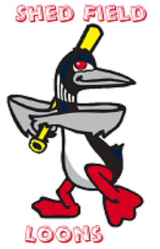
This logo just looks like bad clip art with a weird font selection and uncentered text. I can appreciate the fact that they colored the bat yellow to directly relate their mascot with the sport, but overall it doesn’t look like they tried very hard. 4/10
4. SWBL Cardinals
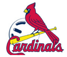
Obviously this is an iconic MLB logo. They added the wiffleball to the background, but otherwise nothing else was changed. 5.5/10
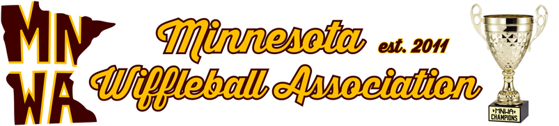
3. MNWA North Stars
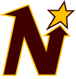
I’m not a fan of reusing existing sports logos, but at least MNWA went with a lesser-known one from their state’s minor-league hockey team and changed its colors. It’s a logo worth branding your team around, but I would have expected more from a team with one of my favorite league logos. 6.5/10
*Editor Note: The Minnesota North Stars were a NHL franchise from 1966-1993 and the moved to Dallas
*Editor Note: The Minnesota North Stars were a NHL franchise from 1966-1993 and the moved to Dallas
2. BCW Keg Crushers
While I would have liked to see a neutral color included in the design to support the stark contrast of the blue and gold, the logo itself is a winner. It’s easy to understand and it has a nice mix of humor and good design. Its versatility also allows it to work well as an insignia or jersey logo. 7.5/10
1. HRL All-Stars
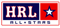
HRL’s logo has changed since last year, and they hit a home run with the new look. It may not be anything to write home about, but it’s a clean, traditional-style logo that’s as strong as their championship-caliber roster. As a fan of minimalistic logos, this is one of my favorites in the tournament this year. 8/10
