New MNWA Logos
11/5/2015
by Trent Steffes
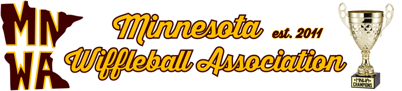
Since we here at MNWA are entering into what we consider a new era, I personally thought it was time to give the MNWA logos an update. In an ongoing effort to make the MNWA as legitimate as we can, I think this new set will do that concept justice. The first logo in the gallery will serve as the primary logo of the set. It's fairly straight forward in that it represents the top of a Wiffleball, a state outline at the top so people know where we come from, and a brand-new custom MNWA font to round it out. The first alternate logo is what I'm calling the "Established" alternate. It follows the same idea as the first, but without the ball concept and a text at the bottom reading: "est. 2011" when or league was founded. The last of the new logo set is our state alternate. This one is a nod to our old league logo. The semi-outline of the state is a four-corners idea I've been trying to incorporate since 2014, and I think it cam to fruition, here. I included the old MNWA logo in the gallery for reference.
Overall, I am very proud of this new set. It will definitely be hard for MNWA players and especially myself to say goodbye to the old logo, as it served as our banner for our first five seasons. But I honestly think this is the start of a new era in MNWA, and I think these logos are going to serve as a perfect symbol of this new, hopefully good era.
by Trent Steffes
Since we here at MNWA are entering into what we consider a new era, I personally thought it was time to give the MNWA logos an update. In an ongoing effort to make the MNWA as legitimate as we can, I think this new set will do that concept justice. The first logo in the gallery will serve as the primary logo of the set. It's fairly straight forward in that it represents the top of a Wiffleball, a state outline at the top so people know where we come from, and a brand-new custom MNWA font to round it out. The first alternate logo is what I'm calling the "Established" alternate. It follows the same idea as the first, but without the ball concept and a text at the bottom reading: "est. 2011" when or league was founded. The last of the new logo set is our state alternate. This one is a nod to our old league logo. The semi-outline of the state is a four-corners idea I've been trying to incorporate since 2014, and I think it cam to fruition, here. I included the old MNWA logo in the gallery for reference.
Overall, I am very proud of this new set. It will definitely be hard for MNWA players and especially myself to say goodbye to the old logo, as it served as our banner for our first five seasons. But I honestly think this is the start of a new era in MNWA, and I think these logos are going to serve as a perfect symbol of this new, hopefully good era.


