2016 NWLA Regionals Uniform Rankings
6/29/2016
by Trent Steffes
So the Regionals round of the 2016 NWLA Tournament has now been completed. I am writing this piece as the regionals go along, so that if in fact my team doesn’t qualify, it’ll be easier to bring myself to write this and get it posted. But of all the uncertainty that Regionals brings to many teams, I’m sure everyone is relieved to remember that the one constant is: Trent’s Uniform Rankings. I consider myself a uniform guru, and have always gone out of my way to make sure that no matter how bad my team is, we’re dressed to the nines most importantly, matching.
This will be my fourth NWLA Tournament Uniform Rankings, and with that experience comes reflection on what this is. I use the term “uniform” quite loosely here, because the majority of teams at NWLA Tournament aren’t actually uniform. There are only a few teams that can actually claim that honor. So there are more like “How You Look” Rankings. And then there is my criteria for ranking. In past years, some teams may have had some really fly jerseys, but found themselves low on the list. And so to clear things up, here is a brief list of what helps you rank high on this list:
So without further ado, here is the 2016 NWLA Tournament Regionals Uniform Rankings. Along with a reminder of where they were ranked last year in the Regionals round, each team will be ranked, receive both positive and negative feedback, and be given suggestions on how they can improve their thread game.
by Trent Steffes
So the Regionals round of the 2016 NWLA Tournament has now been completed. I am writing this piece as the regionals go along, so that if in fact my team doesn’t qualify, it’ll be easier to bring myself to write this and get it posted. But of all the uncertainty that Regionals brings to many teams, I’m sure everyone is relieved to remember that the one constant is: Trent’s Uniform Rankings. I consider myself a uniform guru, and have always gone out of my way to make sure that no matter how bad my team is, we’re dressed to the nines most importantly, matching.
This will be my fourth NWLA Tournament Uniform Rankings, and with that experience comes reflection on what this is. I use the term “uniform” quite loosely here, because the majority of teams at NWLA Tournament aren’t actually uniform. There are only a few teams that can actually claim that honor. So there are more like “How You Look” Rankings. And then there is my criteria for ranking. In past years, some teams may have had some really fly jerseys, but found themselves low on the list. And so to clear things up, here is a brief list of what helps you rank high on this list:
- Hats
- Matching Shorts
- HATS
- Matching Socks
- HATS!!!
So without further ado, here is the 2016 NWLA Tournament Regionals Uniform Rankings. Along with a reminder of where they were ranked last year in the Regionals round, each team will be ranked, receive both positive and negative feedback, and be given suggestions on how they can improve their thread game.
24. BWACS Lot Lizards (18 in 2015)
A last place ranking for the boys from Chicago may seem a bit cruel. They only had a few days to even plan this trip, so uniforms were probably one of the last things on their mind. But the really cool part about BWACS this year is that they had two different set: a red shirt and a grey shirt. I really appreciate the effort into hand making two different shirts but in the end, it would be really unfair for me to rank them higher than 24 when there isn’t anything on the front of the shirt
23. SRL Hotel Sterling (16)
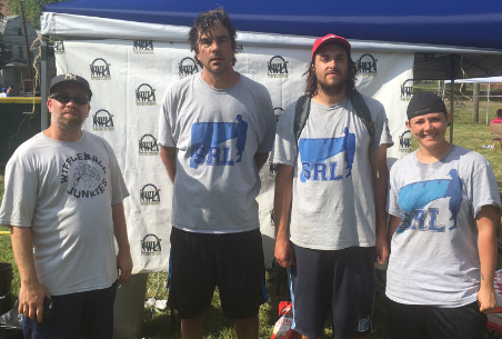
It’s no secret, I’ve been a critic of SRL’s unis in the past and this year is no different. It even looks as if one of their players didn’t even wear the team shirt. If I remember correctly, that got some people in hot water at nationals last year.
22. GAWL Stars (n/a)

The GAWL Stars turned some heads at the New York regional and ended the day 3-2 with their ticket punched for Ohio, which is really good for them. Unfortunately for them, the only remotely matching thing about their uniform was a plain white tee with the busy logo on the front. I’m sorry for the low ranking, but I can’t wait to meet you guys in Ohio.
21. SEA Freeze (n/a)
If I’m not mistaken, this Seattle league has ties to WSEM, and their shirts reflected those ties. They opted for “Dads” green looking shirts with their logo on the front, and nothing else about the uniform matched. While it’s a good-not-great looking shirt, literally everyone seems to be doing their own thing otherwise. Tsk tsk.
20. BWBL Breaker Boys (11)
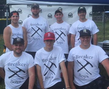
This is a really solid logo that turned out to be a really lackluster shirt. I’m a fan of the pick axe logo, but it is really hard to pull off a black and white color scheme with that kind of logo as the centerpiece. It’s a drop off from their purple shirts from last year but I have to give credit to the logo.
19. SFWL Loons (19)
In a bonafide upgrade from their shirts last year, Shed had some pretty good looking shirts. They have a US Flag emblem on the front so it plays to the patriotic theme. My only critique is that the bird on the front is not a loon. It’s definitely a duck.
18. GCWL Make Wiffleball Great Again (n/a)
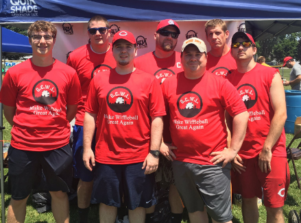
I’m sort of up in the air for this one. On one hand, red and black is a great color combo that is nearly impossible to get wrong. On the other, GCWL seemed to incorporate one too many things on the front of these shirts. Featuring only the league logo would’ve looked fantastic. But they added the team wordmark underneath, and it may be the most generic word mark in the history of word marks. Which is totally fine, but I’m a picky guy. Matching Reds hats would’ve been a great way to go for these fellas.
17. LWA Legends of Leroy (n/a)
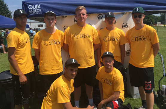
I’m a big fan of the black and gold combo, but there isn’t much to write home about these shirts, in particular. IT seems as though most of them are wearing the same type of hat, featuring a logo with an “I” and “C” interlocking, but there are three different colors of the hat, and it really doesn’t make sense to me.
16. MFWL Road Runners (n/a)
|
|
Mick Fenway really went out of the box with these shirts. They put their main logo art on the back of the shirt, and opted to go with a crest on the left breast of the front of the shirt, and numbers on the right. A very interesting look, and I’m not too sure how I feel about it. The attempt at matching red shorts is super unique and appreciated.
15. HWL Blizzard (n/a)
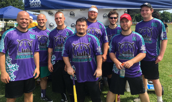
So the last time the HWL team was in NWLA Tournament, they were known as the Brew Jays and had a very sharp looking uniform set with matching hats and dark grey shirts. This edition of the HWL decided to come totally out of left field. Josh Smith brought yet another unique color scheme to this year’s regionals with purple and teal. Definitely haven’t seen that before. Josh also picked out a very cool jersey, with the elements of the team name “Blizzard” everywhere in the form of snowflakes. They all seem to be wearing matching black shorts (except for the fellow in the back with matching teal shorts. Atta boy, kid) and the jersey keeps on growing on me.
14. GBL Paw Chests (13)
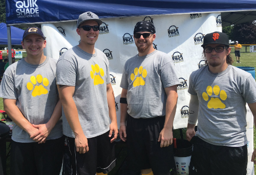
The thing I love about GBL’s shirt is the fact that they convey their team name without a single letter on the shirt. The Paw Chests’ threads literally feature a paw on the chest of the shirt. Classic. I really hate to rank GBL this low because I absolutely love the shirt, but it’s not the best shirt in the tournament, and it’s the only thing matching. One can only be excited to see the laundry combos that Griffle might bring to Ohio.
13. KWL Keggers (14)
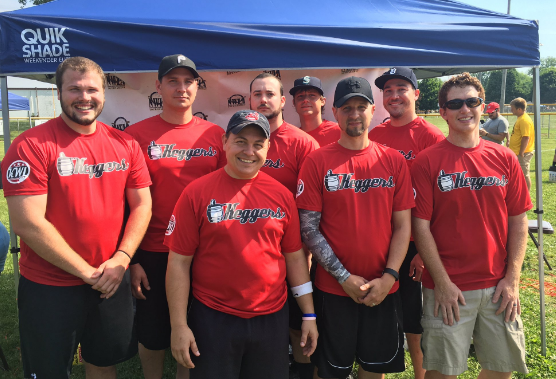
It’s hard to describe, but there is something glorious about these jerseys. The wordmark is no different from their jerseys in 2015, but the black letters and white outline on a red shirt just absolutely pops and looks awesome. Unfortunately, there isn’t much other than the jersey that really stands out about the overall jersey, but damn do I love those shirts.
12. SWBL Cardinals (7)
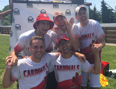
Are these guys even wearing jerseys? Because I can’t get over the attractiveness of the faces of the men wearing them. Like I say every year, it’d take a simple Cardinals hat for each of them, to shoot them up the rankings but I can’t say anything bad here.
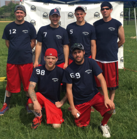
11. HVWBL River Monsters (17)

|

|
I got an early preview of the HVWBL River Monsters’ jerseys from my boy Kris Morse and I was honestly super impressed. Our two leagues came into the tournament the same year, so we have a little bond there. Their shirts the past two years have been plain, but not awful. But they decided to really step it up this year. Kris shot me a few pics of the two jerseys they had with the hope that they would shoot them up the rankings and they did. Kris decided to go with a sick color scheme this year and one we really haven’t seen before in neon green and black. The Digi-camo is a rehashing of 2015 WSEM but it worked well, in my opinion. And the other shirt brought out a totally different style with the same wordmark. Well done, Kris. You made the effort to match your shorts with your shirt, as well. If the rest of the squad takes that same initiative for Ohio, it’d be easy to see the River Monsters crack the Top Ten.
10. WWF New Wiffle Order (n/a)
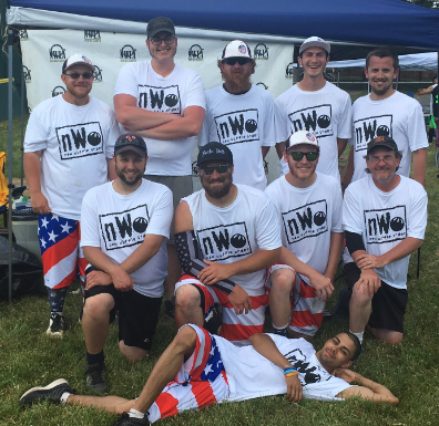
I have to say, it was ballsy for the nWo not to go with black shirts. Obviously, I know black is a bad choice for wiffleball in the summer, but it’s the nWo. They were known for their black shirts. Either way, the shirt logo they had put on looks better than their team log on its own. It seems like a few of their guys have matching hats, but the coolest part about this uniform is the American flag shorts. Does it make sense? No. Does it work? Yes.
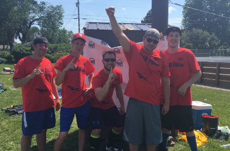
9. IWBL Hot Rods (n/a)
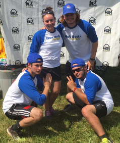
Interstate is officially the Brew City of this year’s regionals uniform rankings. They may not have shown a lot on the field, but they looked good doing it (that’s a reference to 2015 BCW. 2016 BCW was something a whole lot different.) The Hot Rods went with a totally classic look with the ¾ baseball tee with the royal blue sleeves and although it may not look like it in the picture, those are matching hats the Hot Rods are rocking. I always love when a brand new league can come out and totally rock a matching uniform set. Way to go, Interstate!
8. HFWB Hitmen (10)
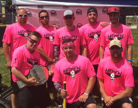
There’s not a lot wrong with these jerseys. They have a unique color scheme and a masterful logo. Unfortunately for this round, there seems to be a lack of matching shorts shown at last year’s nationals and once again: not hats. So while the shirt is nearly flawless, there’s still a lot of work to do on the set.
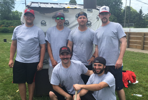
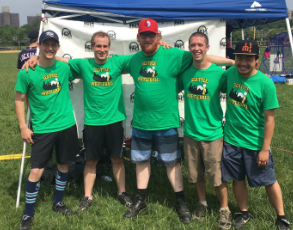
7. MNWA North Stars (2)

|

|
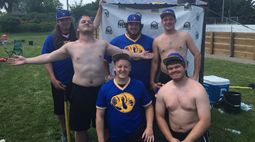
So this round was super embarrassing for me. Obviously, my team’s uniform is paramount to me and this year we were left out to dry with them. My screen printer told me Friday afternoon that our regionals shirts weren’t going to be done in time for regionals, so I had to call an audible and go buy plain white shirts and some fabric paint and take matters into my own hands. I tried to go with iron on numbers on the back but the concept of that really seems to escape me so I just used the cut out numbers and sprayed the paint around them. We matched up our hats from last year with these white tops, and in my opinion, those hats with white shirts looks absolutely phenomenal. Add to the fact that I kept all my players in plain black shorts and I maintain that even though our shirts were atrocious, we had a solid overall uniform.
6. TBW Lightning (3)

For the first time in history, I believe, the TBW Lightning were not matching during the NWLA Tournament. Derek Linderman usually has a strong grasp on the uniforms, but this year’s edition seems to be just a mismatched jumble of past year’s elements. With that said, they still look amazing. Their gold shirt is a really solid shirt.
5. PWL Nationals (4)
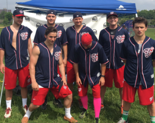
Gallaway’s Nationals are always all matching, all the time. They have matching jerseys, shorts, and authentic caps. It really is hard to beat the quality of their uniform. The one thing I keep holding against them, however, is that there’s nothing special or unique about the uniform set at all.
4. WSEM Dads (6)
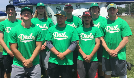
You caught me, I’m a hypocrite. WSEM’s uniform set was pretty mismatched this year but I don’t care. I love those jerseys and I love the team hats they continually wear. Chandler, Austin and Kyle represent what we’ll see at nationals in a few weeks and this ranking is more of a preview of what’s to come rather than what they wore.
3. BCW Keg Crushers (5)
Brew City in the number three slot may be surprising, but don’t let the shirtless-ness and the keg fool you: these guys looked like absolute pros on the rinks in Eagan. If for nothing else, Chris Neumann can be seen as a manager who makes sure his team looks good. Everyone has the matching cap with the classic Brewers logo on it, and the shirt features their famous keg crushing logo. I can’t express anything but love for this team both on and off the field. Great guys who look great playing wiffleball.
2. OCWA Freaky Franchise (2)
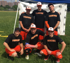
With the Angels signing of Tim Lincecum, the Freaky Franchise changed their color scheme to red and navy blue but they could not get uniforms made in the time for regionals to reflect those changes. They rolled with an old 2015 combination which even though it looked really good as always, wasn’t enough to maintain their number one ranking.
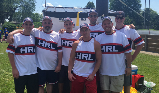
1. HRL All-Stars (20)
WORST TO FIRST. WORST TO FIRST. In 2015, HRL hosted a regional wearing plain white tee shirts with their names literally written on the back with a sharpie. Then they went on the wear some very interesting jerseys in Ohio that didn’t garner a high ranking. But this year, they knocked it out of the park. Probably because Vlade wasn’t in charge. They interestingly went with a classic Chicago White Sox (Hometown Minnesota Twins rival) look with color to match the league-wide hat made available for purchase this spring. It’s common knowledge that I am a huge Freaky Franchise fan, and that I had ranked them #1 for all three previous uniform rankings. So it would’ve taken a monumental effort to unseat the boys from Bush Grapes Park. But HRL has made that effort and I will acknowledge it. I was very impressed, boys.
